A Shift of Identity - Sharojini Lewis
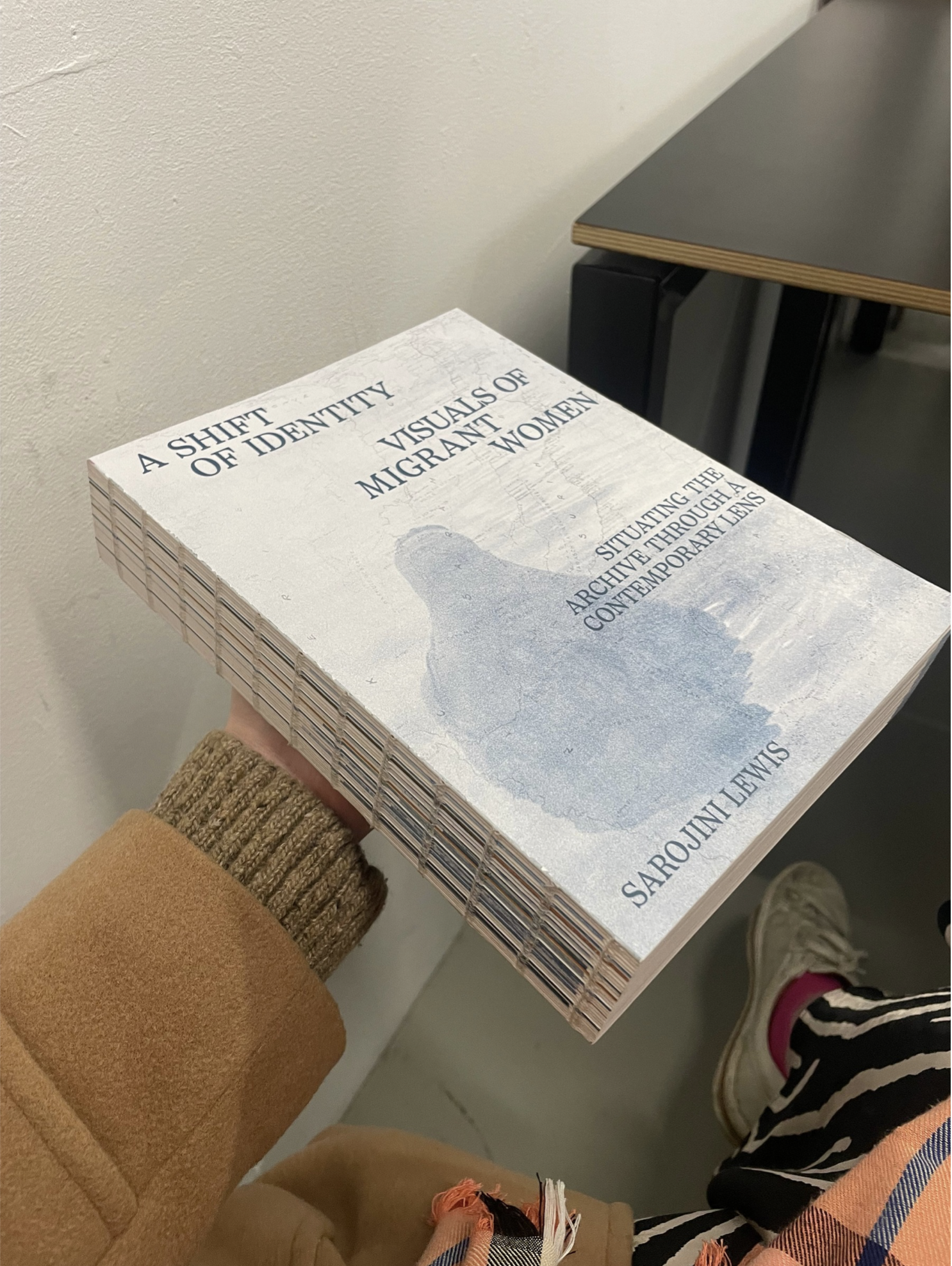
I really liked this book design, particularly the balance between its subtle exterior and the conceptual depth it communicates. The cover uses a muted, almost washed-out colour palette, which immediately creates a calm and reflective tone. The soft blue-grey imagery feels abstract yet suggestive, allowing space for interpretation while tying into the theme of identity and migration. The typography is minimal and well-spaced, giving each line room to breathe and reinforcing a sense of clarity and sensitivity in how the subject is presented.
The layout of the text on the cover feels carefully considered, with hierarchy established through scale and positioning rather than heavy styling. This restraint allows the content to feel more serious and respectful, which suits the topic. I was particularly drawn to the exposed binding along the spine, as it becomes a key visual feature rather than something hidden. The visible stitching gives the book a raw, honest quality, revealing how it is constructed and adding a tactile, handcrafted feel.
I think this works especially well in contrast to the clean and controlled typography on the cover. The repetition of the exposed Swiss-style stitching creates a subtle rhythm, while also breaking away from a polished, mass-produced aesthetic. Overall, the combination of delicate visuals, structured type, and exposed binding creates a thoughtful tension between refinement and honesty, reflecting the themes of identity, history, and documentation explored within the book.