Obayoli
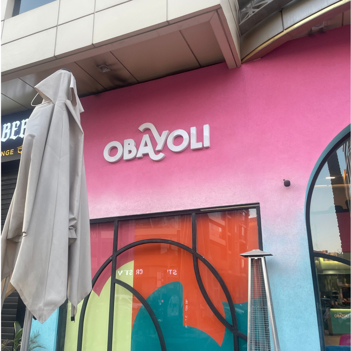
I discovered this dessert shop branding while on holiday in Morocco and was immediately drawn to its bold and playful visual identity. The brand, Obayoli, uses bright, vibrant colours across the exterior, blending pinks, oranges, and blues to create an eye-catching and contemporary aesthetic. These colours feel energetic and inviting, perfectly suited to a dessert-focused space, while also reflecting the warmth and vibrancy often associated with Moroccan street environments.
What stood out most to me was the lettering. The typography is clean and modern, but incorporates subtle ornamental details, particularly in the “A” and “Y.” These letters feature soft, flowing swirls that intertwine, creating a visual link to traditional Arabic calligraphy. This is especially interesting within the context of Morocco as a bilingual country, where both Arabic and French are used. The design cleverly blends these influences, using a largely French-style sans-serif base while integrating decorative elements inspired by Arabic forms.
I also really liked the positioning and balance of the lettering. The interlocking curves create a sense of movement and rhythm, adding personality without overwhelming the simplicity of the overall logo. This minimalist yet expressive approach results in branding that feels both modern and culturally grounded.