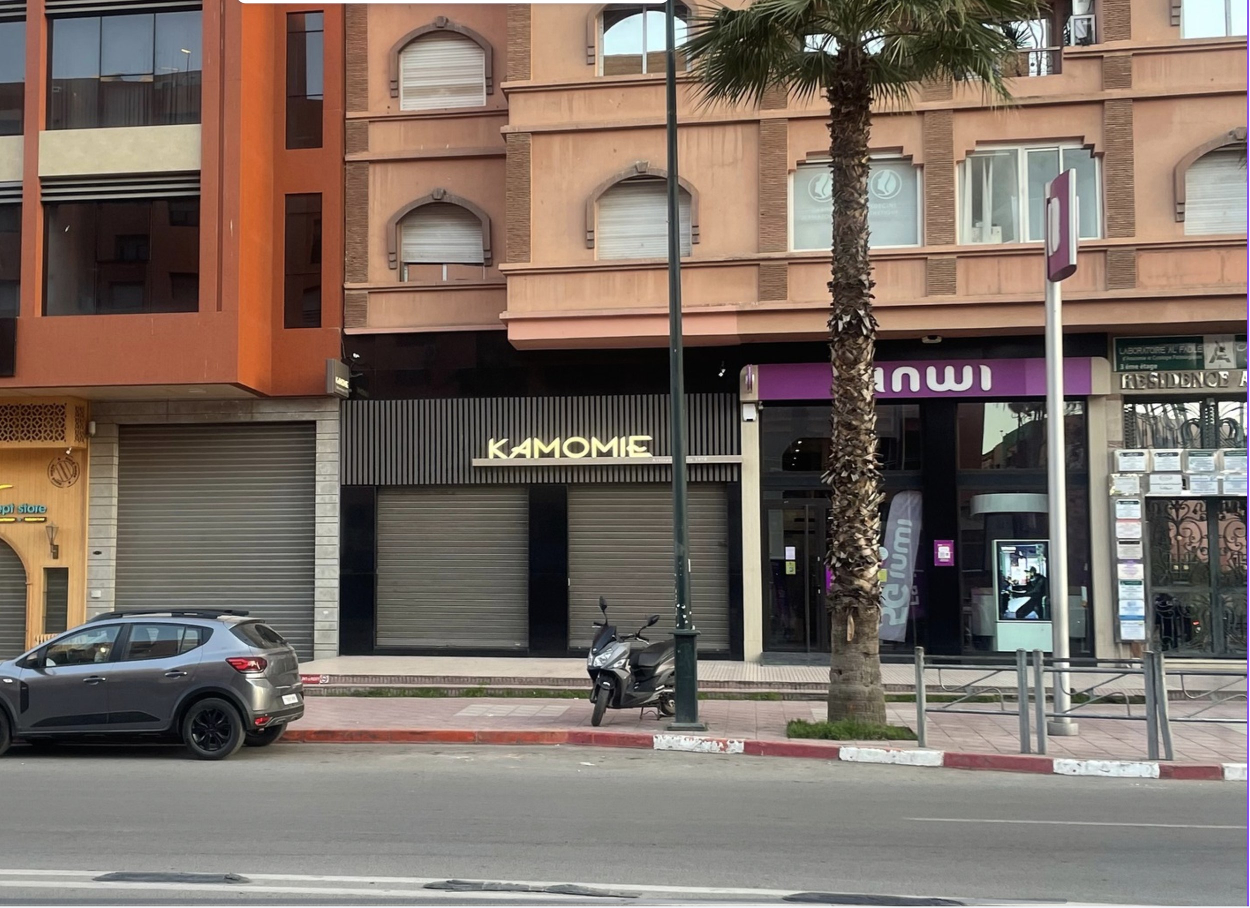
Kamomie
I discovered this branding while on holiday in Morocco and was particularly drawn to Kamomie’s clean and refined visual identity. In contrast to more vibrant storefronts, this beauty salon uses a simple black and white colour palette, creating a minimal and sophisticated aesthetic. This restrained use of colour allows the typography to become the focal point, giving the brand a more premium and contemporary feel.
What stood out most to me was the lettering. The typeface has a distinctly French influence, with a sleek, modern sans-serif style that feels elegant and understated. This reflects the strong presence of French language and culture within Morocco, and positions the brand in a more high-end, fashion-oriented space. At the same time, there is a subtle softness to the letterforms, echoing organic curves often found in Arabic script. This creates a quiet fusion between French typographic structure and Arabic visual influence.
I also appreciated how this balance appeals to a bilingual audience. The branding feels accessible and familiar to both French and Arabic speakers without relying heavily on either language directly. Overall, Kamomie’s identity successfully blends cultural references through minimal design, using typography and colour to create a brand that feels both modern and rooted in its environment.