Transfigurations Book by Remy Jungerman
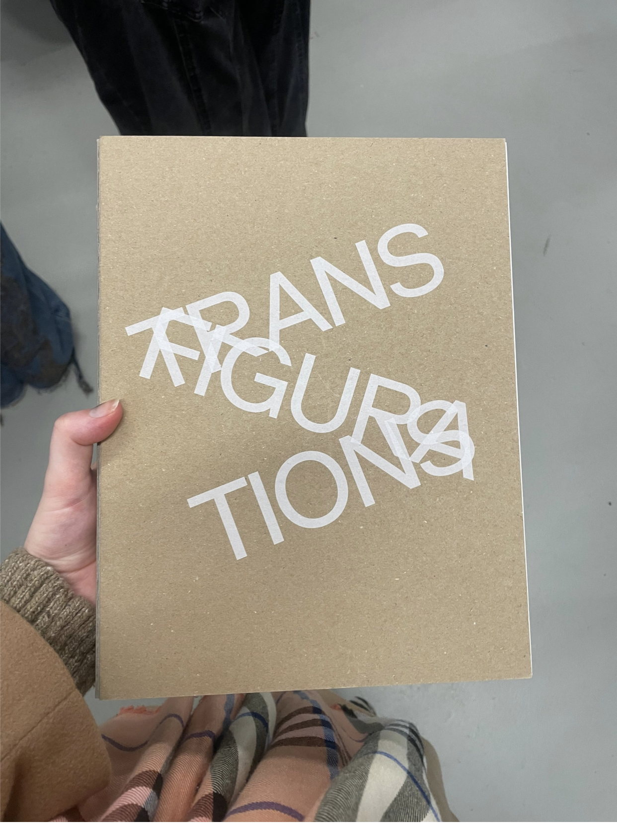
I really liked this book design, particularly the way it explores the manipulation of letters and words throughout. The typography reflects the concept of transfigurations, where distortion and transformation are central themes. The shifting, fragmented letterforms feel intentional and expressive, reinforcing the idea of change and instability within the text itself. This creates a strong connection between content and form, making the design feel concept-driven rather than purely decorative.
I also really appreciated the material choices used in the book’s construction. The brown card cover paired with clean white lettering creates a simple yet striking contrast, giving the book a raw and tactile quality. This minimal exterior allows the experimental typography inside to take focus, building a clear distinction between outside and inside.
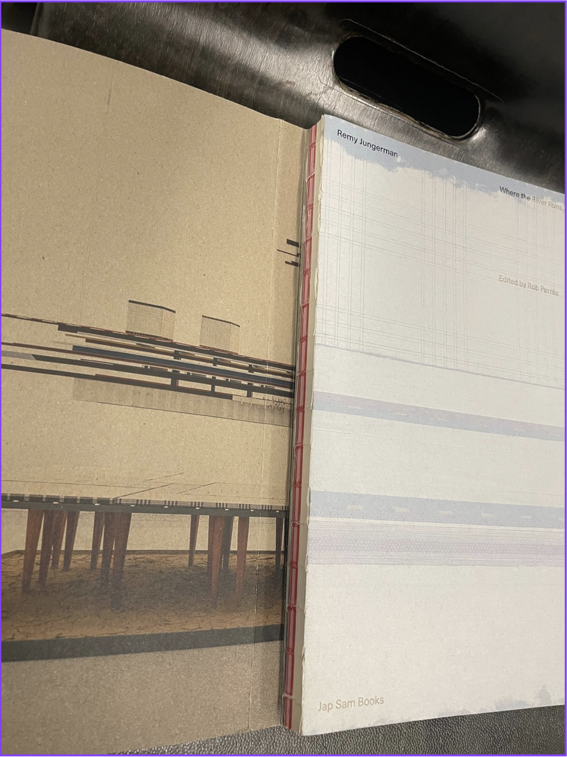
The Swiss binding and exposed spine were particularly effective design choices. The exposed structure reveals how the book is made, adding a sense of honesty and openness to the object. I believe this works especially well alongside the tightly controlled and detailed typography throughout the pages, as the structured interior contrasts with the more deconstructed, visible spine. Overall, the combination of typography, material, and binding creates a cohesive and thoughtful design.