Photography Publication
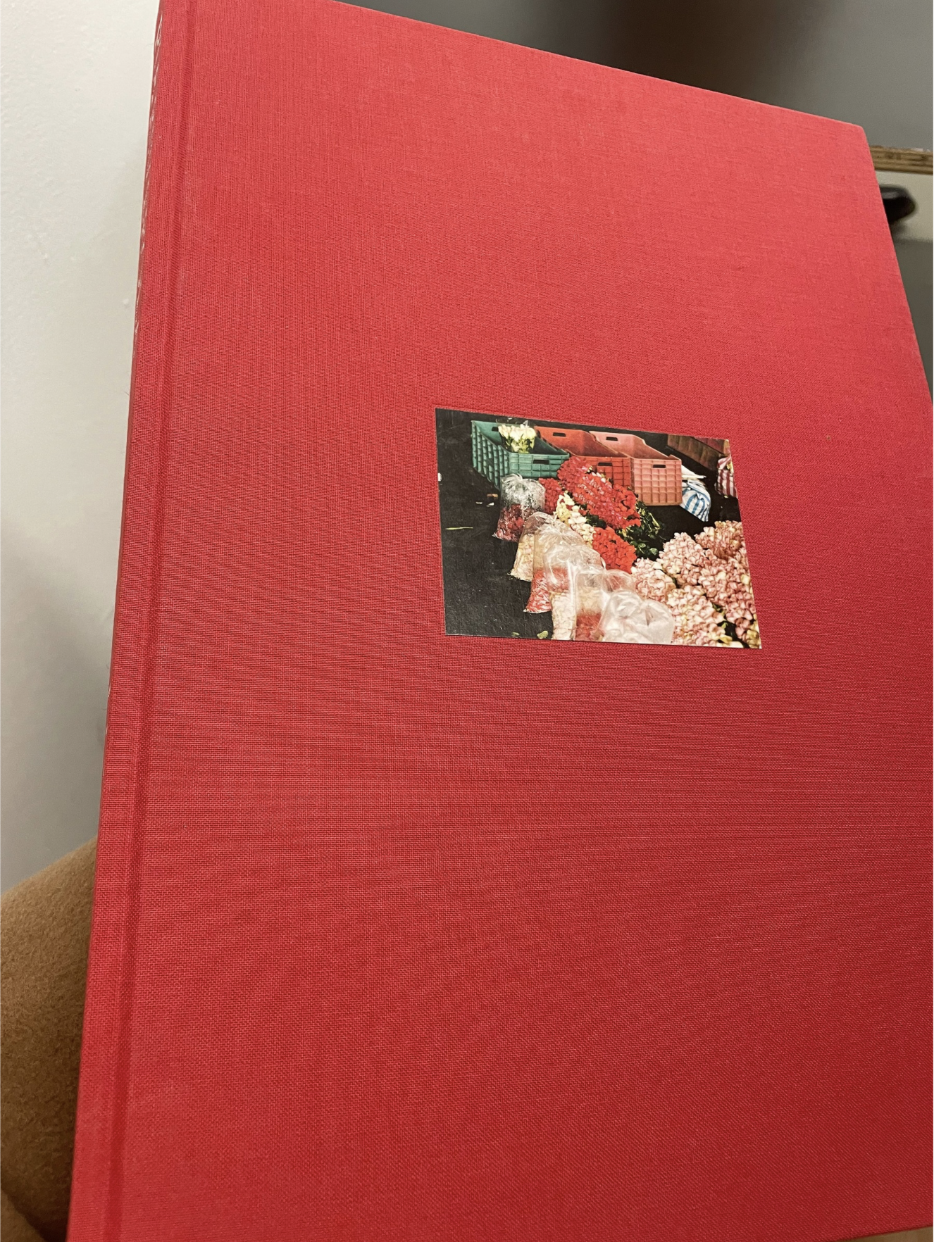
I really liked how the designer approached this photography book, keeping the exterior simple and understated while creating a highly organised and detailed interior. This contrast allows the focus to shift directly onto the content, making the photography feel more intentional and carefully curated. The minimal outer design sets a calm tone, which is then contrasted by the structured and visually engaging layouts inside.
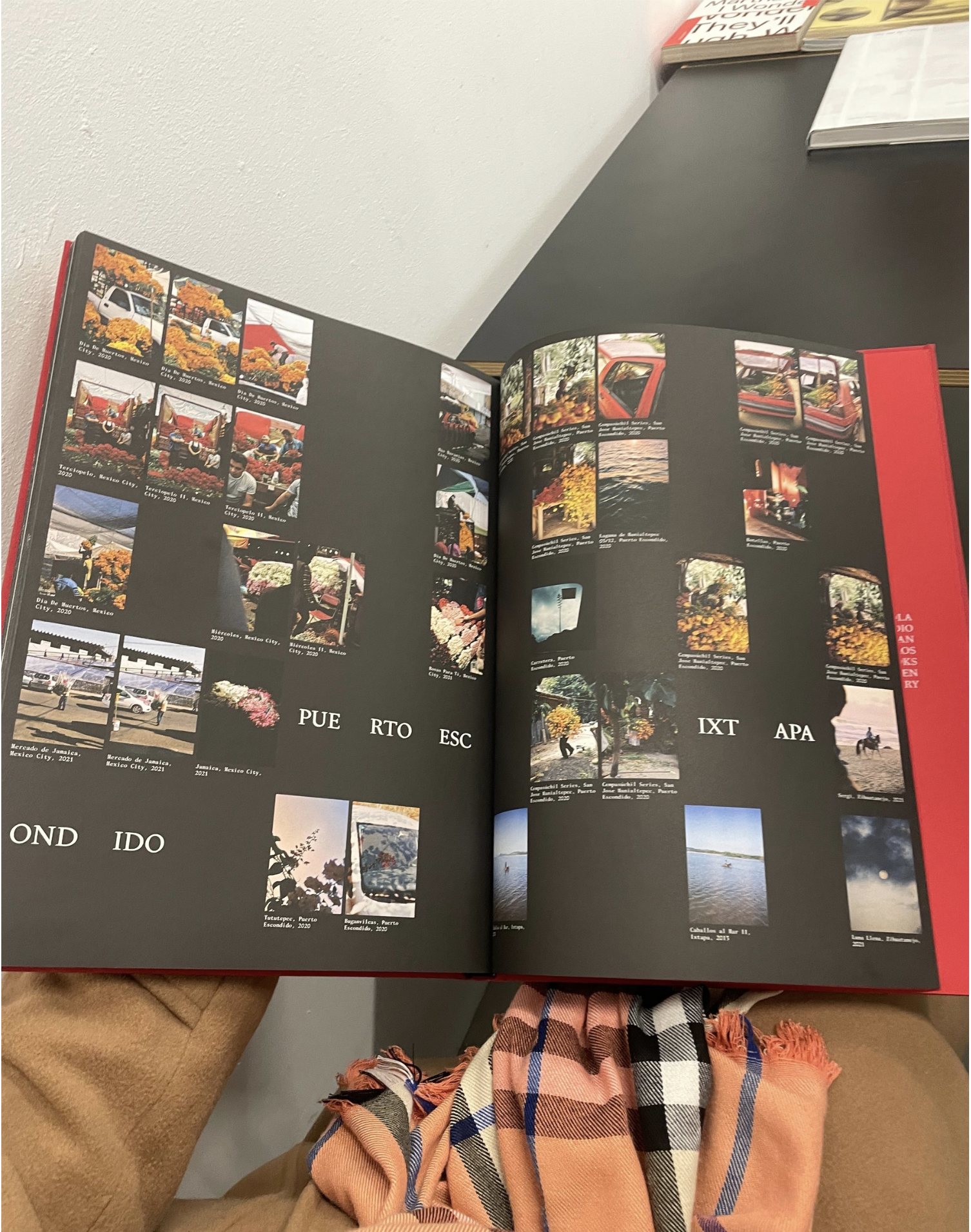
The use of a 6-box grid system is particularly effective, providing a strong and consistent framework throughout the book. This grid allows for flexibility in the placement of images and text, while still maintaining a sense of order and balance. The manipulation of these elements within the grid creates a rhythm across the pages, guiding the viewer through the work in a controlled and thoughtful way.
I also really appreciated the contrast between the dark pages and the light-toned photographs. This juxtaposition enhances the visibility and impact of the images, allowing them to stand out more clearly. The darker backgrounds act as a subtle frame, adding depth and focus to each photograph. Overall, the combination of simplicity, structure, and contrast results in a refined and visually compelling presentation.