Kindred Newspaper
This newspaper design follows a broadsheet format, a typical newspaper size in graphic design that allows for expansive layouts and strong visual storytelling. The large scale supports a clear and structured grid system, with multi-column layouts that organise content efficiently while maintaining readability. The use of generous margins and consistent gutters helps guide the reader’s eye across the page, reinforcing a sense of hierarchy and balance.
Typography plays a key role in establishing an editorial tone. A high-contrast serif typeface is used for headlines, giving a refined and classic feel often associated with traditional print media. This is paired with a more legible serif or subtle humanist typeface for body text, ensuring clarity in longer passages. The variation in typographic hierarchy—from large display headings like “Hello & Welcome” to smaller subheadings and body copy—creates a clear flow of information.
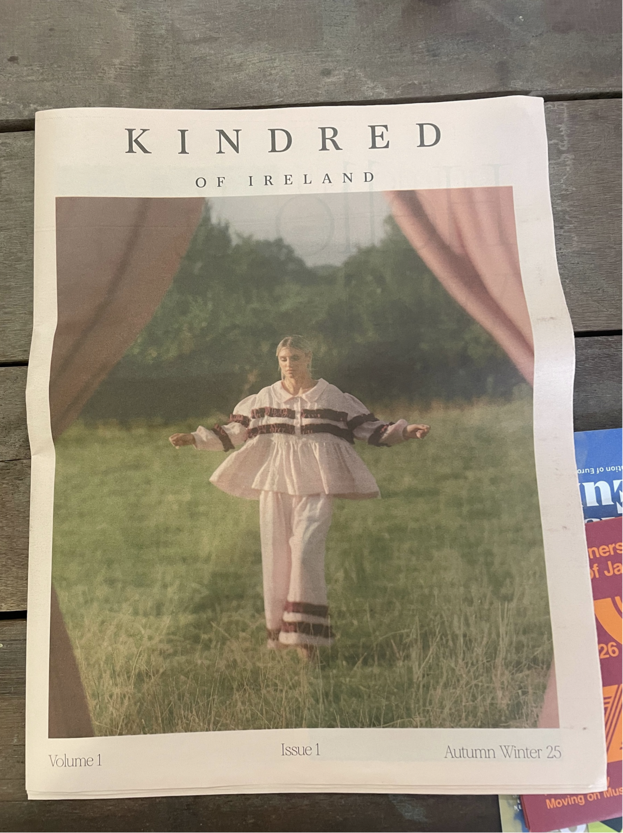
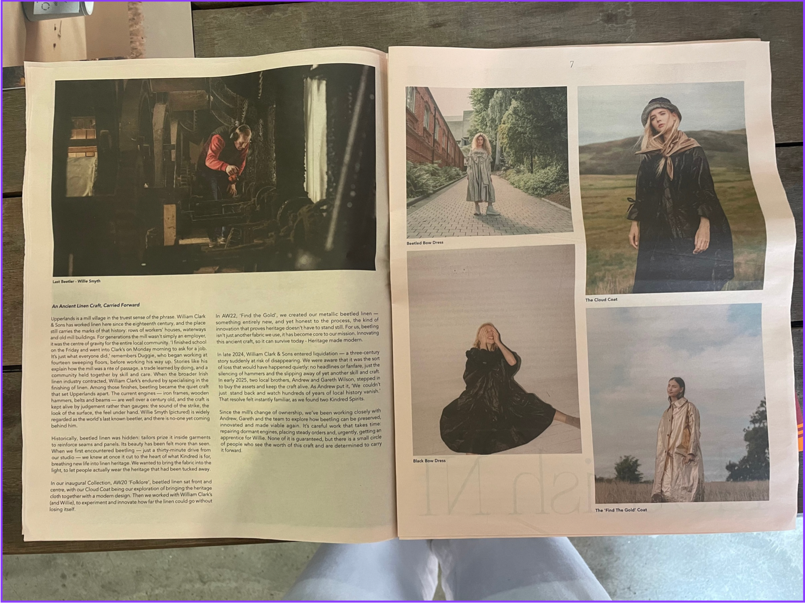
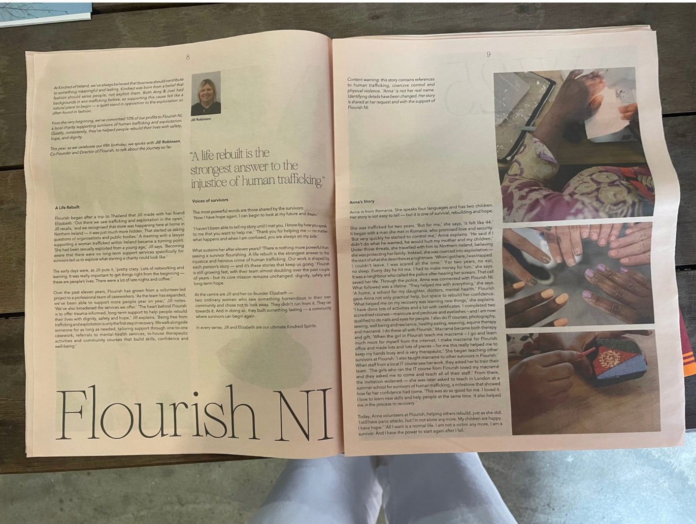
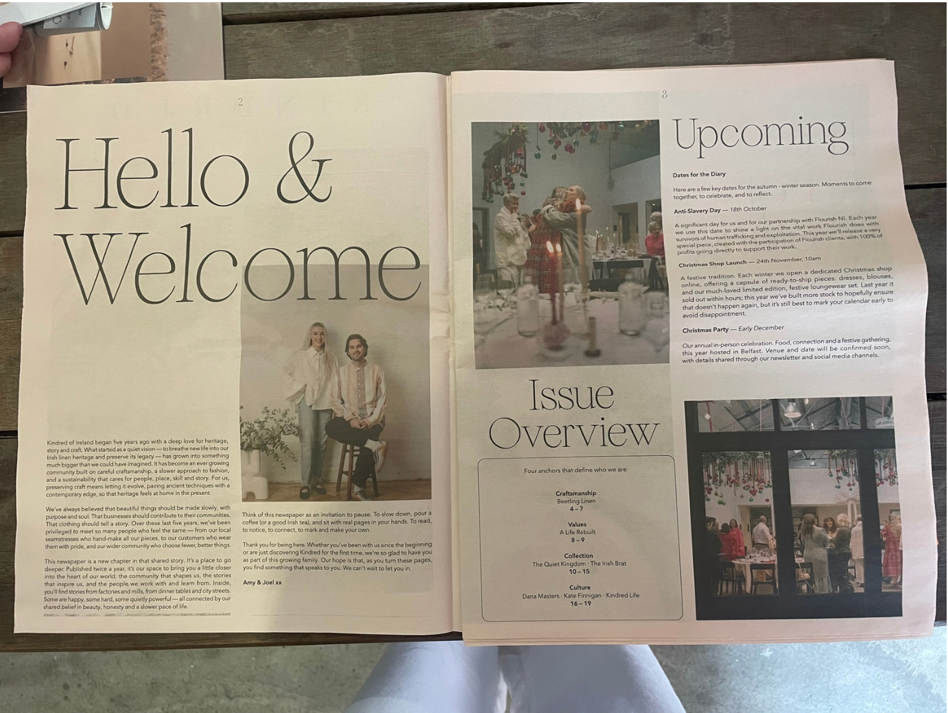
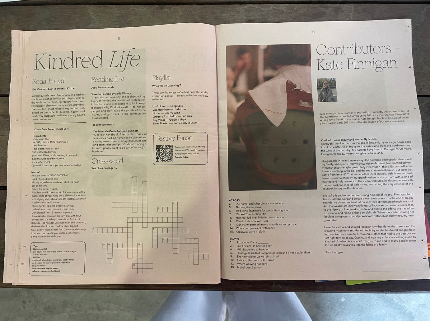
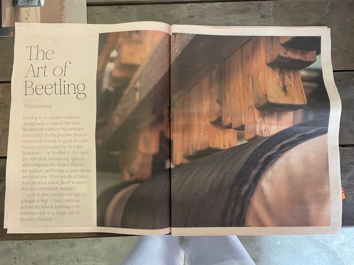
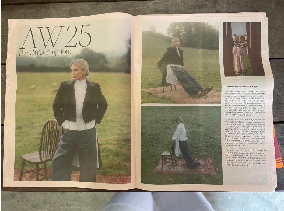
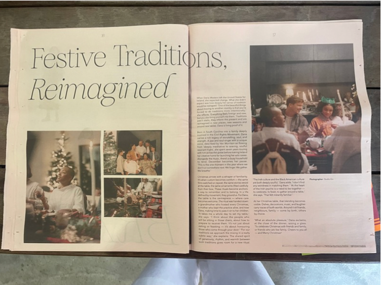
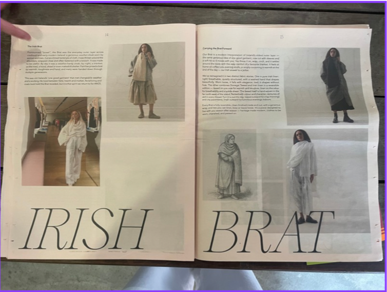
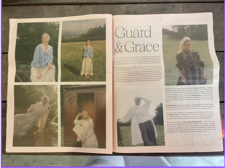
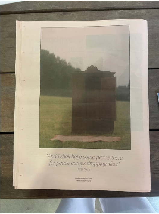
The imagery is predominantly editorial fashion photography, featuring soft, natural lighting and muted tones. These full-bleed images and image-led spreads create visual impact, while smaller inset photographs support the narrative. The overall layout balances text and image effectively, combining traditional newspaper conventions with a more contemporary, magazine-inspired aesthetic.