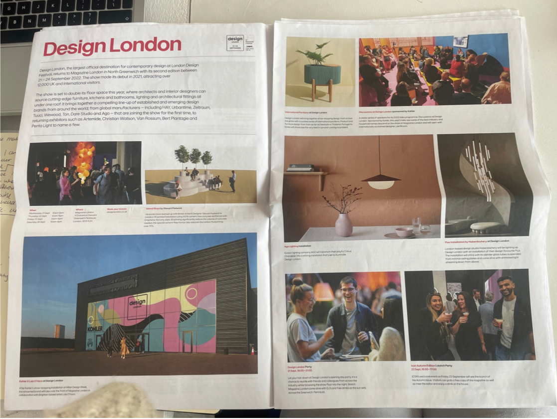
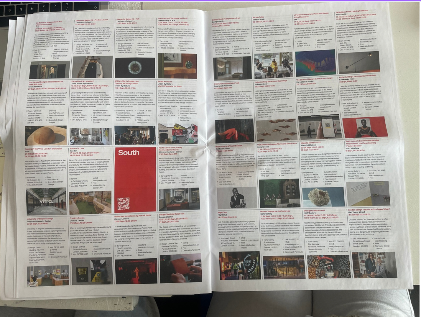
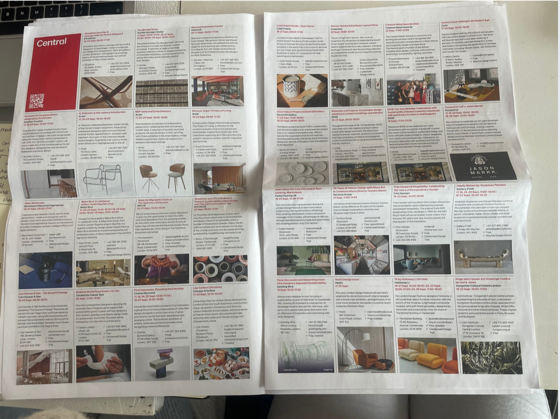
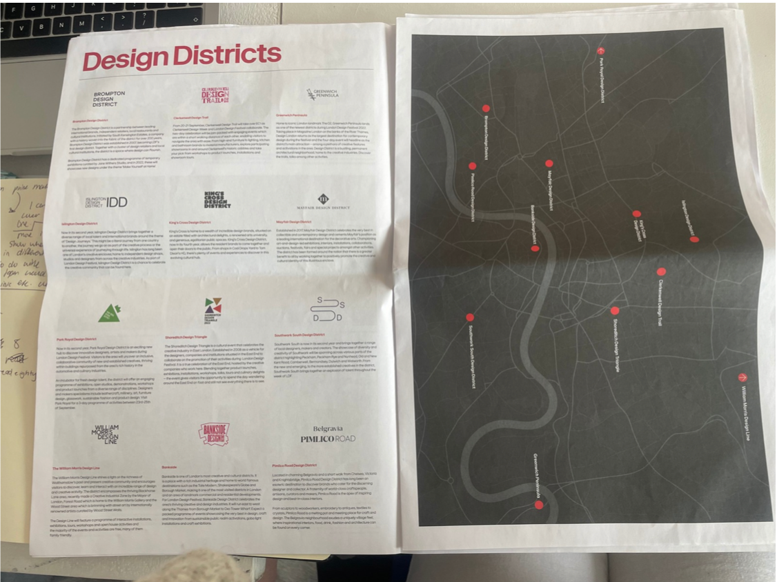
Programme 20
This newspaper-style publication follows a standard broadsheet format, a typical large-scale size used in graphic design for editorial layouts, allowing for expansive content and clear hierarchy. The design employs a structured grid system, likely a multi-column layout, which organizes dense information into readable modules. Margins and gutters are consistently applied to maintain alignment and visual rhythm across spreads.
Typography is predominantly sans-serif, suggesting the use of a neo-grotesque or humanist sans-serif typeface for clarity and modernity. Headings use bold weights and increased scale to establish hierarchy, while body copy is set in smaller, regular weights for legibility. There is effective use of typographic contrast, including variations in size, weight, and colour (notably red accents) to guide the reader.
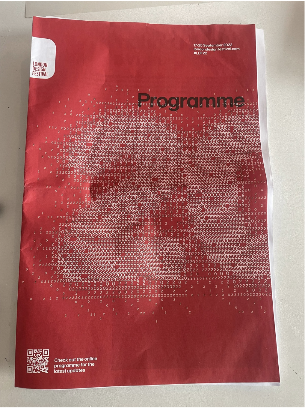
The imagery includes a mix of photographic content and graphic compositions. Hero images and full-bleed visuals create impact, while smaller thumbnail images are arranged in a modular grid, functioning almost like an index or catalogue. The cover features a data-driven or typographic image, constructed from repeated numerical characters, forming a rasterised visual effect.
Additional elements such as QR codes, captions, and informational panels enhance interactivity and navigation. Overall, the layout balances editorial and promotional design through clear hierarchy, consistent grid use, and contemporary visual language.