Raeburn Newspaper
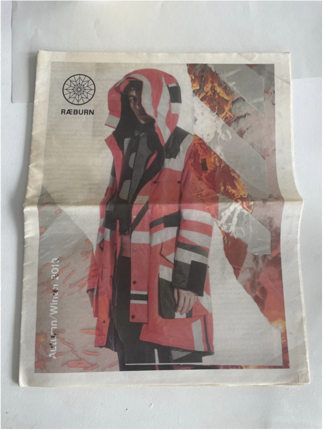
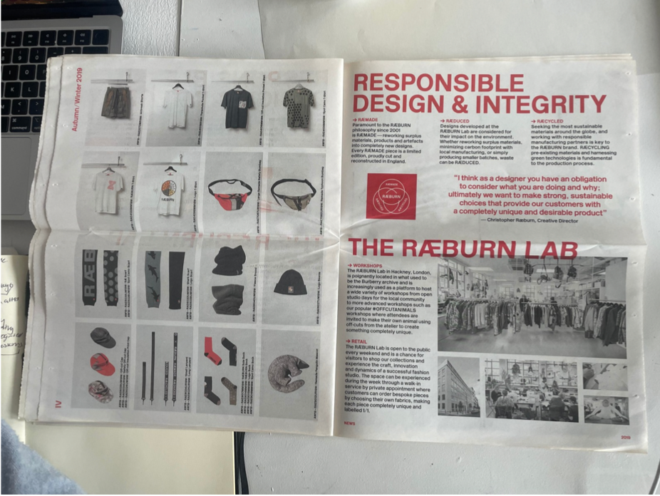
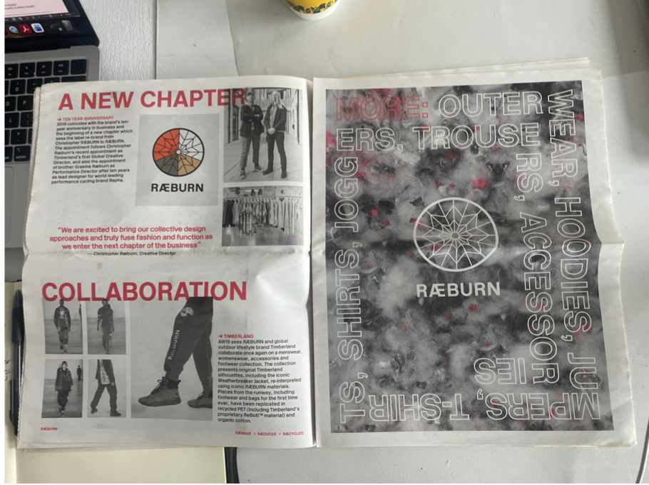
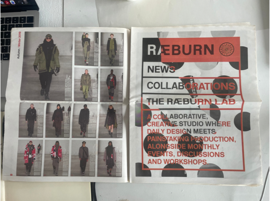
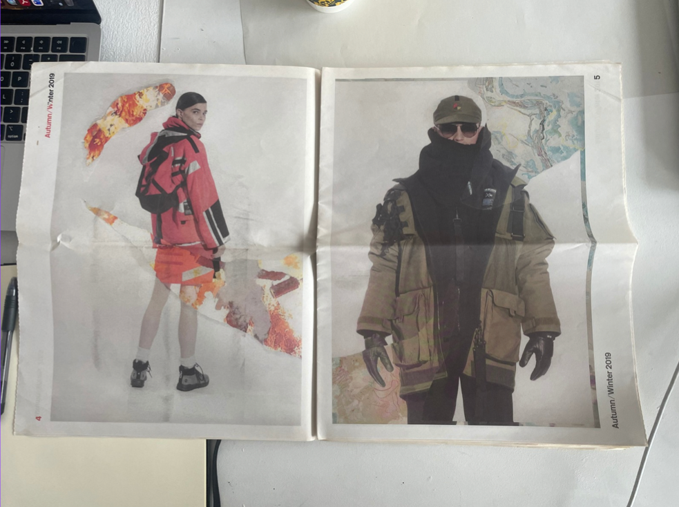
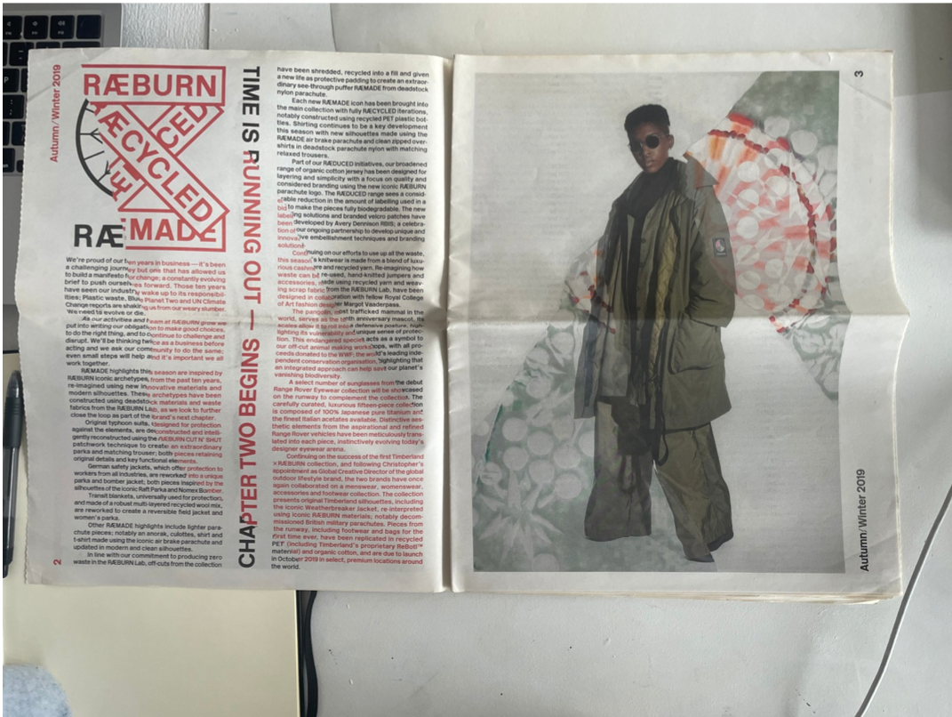
This newspaper design appears to follow a broadsheet format, a standard large-scale size in graphic design that allows for expansive editorial layouts and experimental visual treatments. The layout still suggests an underlying grid system, but it is intentionally disrupted through collage and layering, creating a more deconstructed and expressive composition rather than a strictly ordered multi-column structure.
Typography combines multiple styles, including sans-serif display type for bold headlines and handwritten or script-style lettering layered within the composition. This contrast creates a dynamic typographic hierarchy, though legibility is partially obscured by the overlapping imagery. Fragments of body text in smaller serif or sans-serif fonts can be seen, indicating a traditional editorial base beneath the distortion.
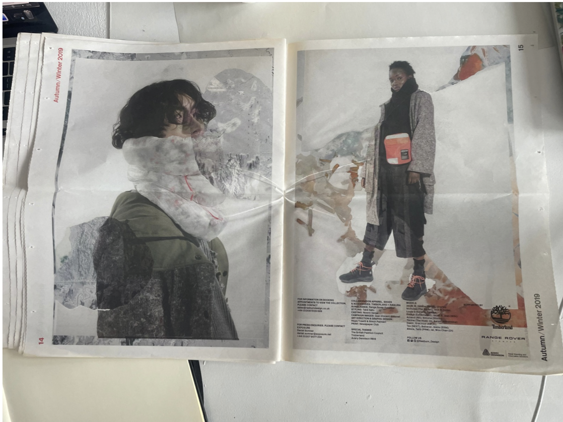
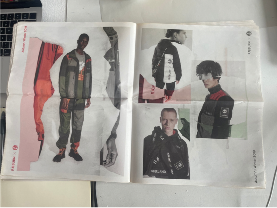
The imagery is highly experimental, using collage, photomontage, and glitch effects. Repeated and sliced photographic elements—such as textiles, signage, and figures—are mirrored and fragmented, producing a layered, almost abstract visual narrative. This technique disrupts the conventional reading flow and challenges the viewer’s perception.
There is heavy use of texture, including fabric and material close-ups, adding tactile quality. The composition breaks conventional alignment, with elements crossing gutters and ignoring margins, suggesting a deliberate rejection of traditional newspaper structure in favour of a more conceptual, contemporary editorial design approach.