Fellow Newspaper
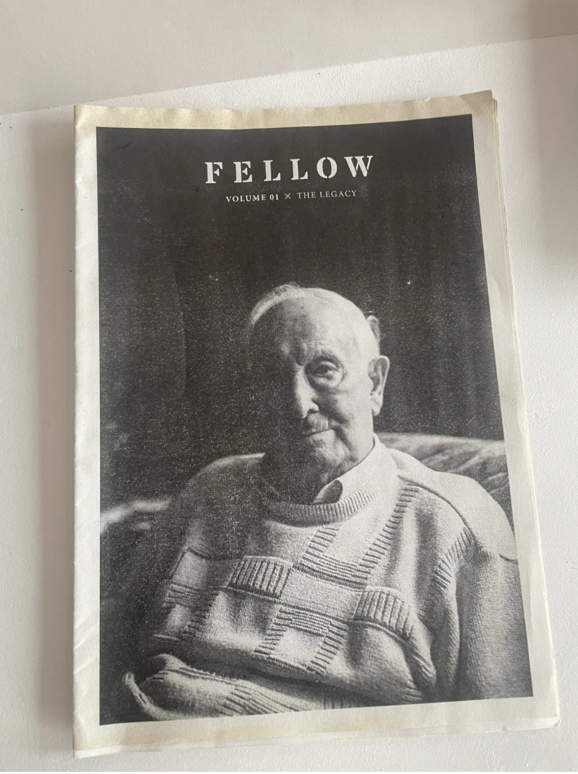
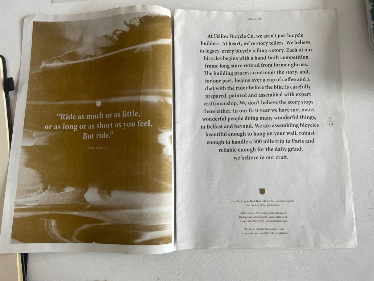
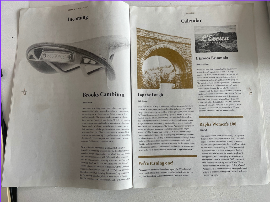
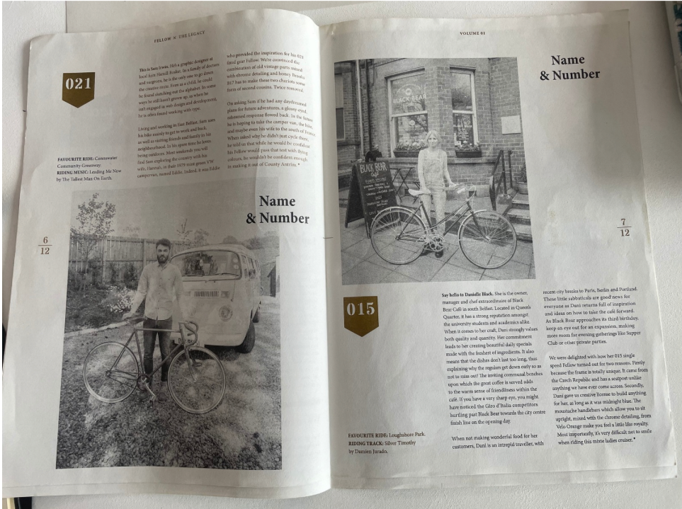
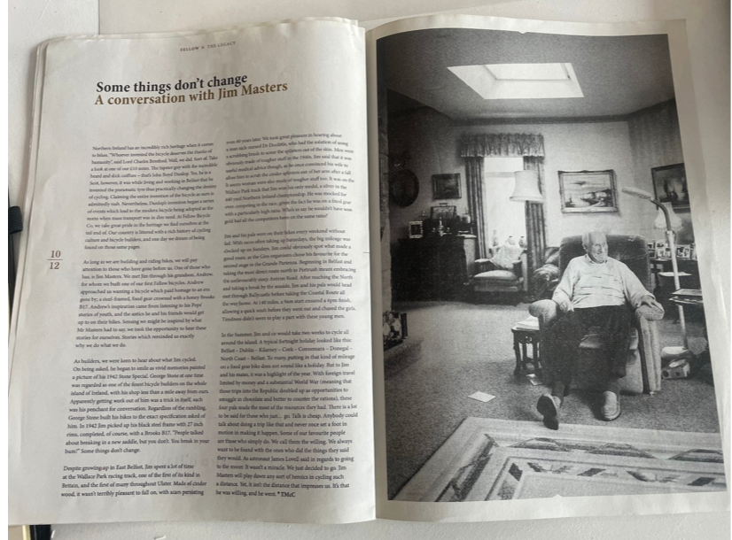
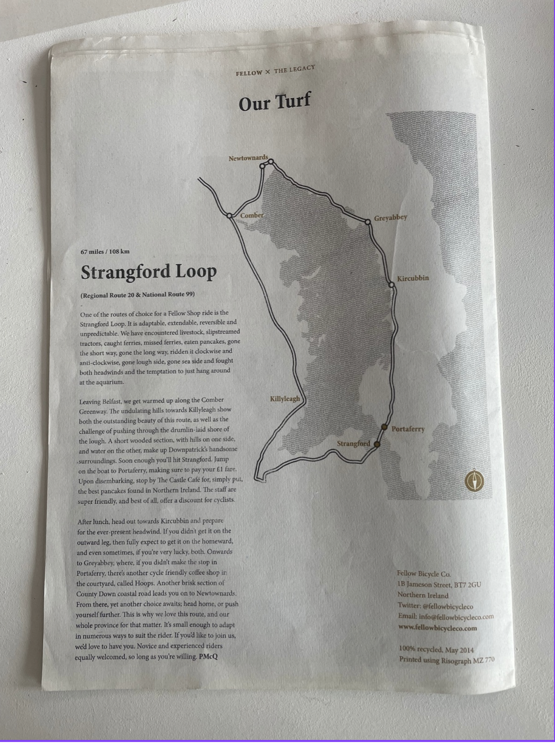
This smaller-format publication adopts a booklet-style newspaper layout, likely closer to A4 folded to A5, which is common in editorial design for more intimate, magazine-like reading experiences. The format suggests a saddle-stitched structure, with visible double-page spreads (DPS) that prioritise narrative flow and pacing. The layout uses a clear modular grid system, with consistent margins, gutters, and column structures that support readability while allowing flexibility for image-led pages.
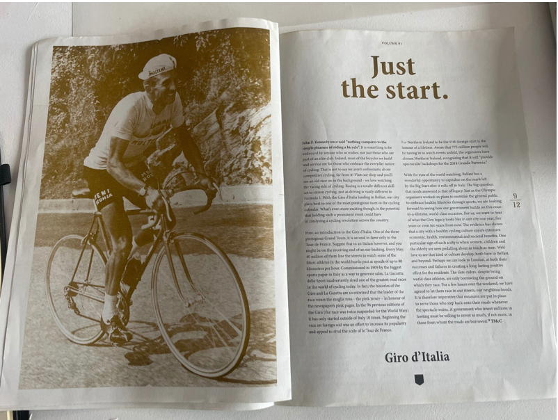
Typography combines a serif typeface for body copy—enhancing legibility in long-form text—with a refined display serif or transitional serif for headings such as “Just the start.” This creates a strong typographic hierarchy through variations in scale, leading, and tracking. The use of generous white space (negative space) and asymmetrical alignment adds a contemporary editorial feel.
The imagery is predominantly editorial photography, including both full-bleed images and half-page inserts, alongside duotone/monochrome treatments (notably sepia tones) that unify the visual identity. There are also pull quotes and feature spreads, which act as visual anchors within the text-heavy pages. Overall, the design blends traditional newspaper conventions with magazine-style aesthetics, resulting in a more curated and tactile reading experience.