Suki Tea
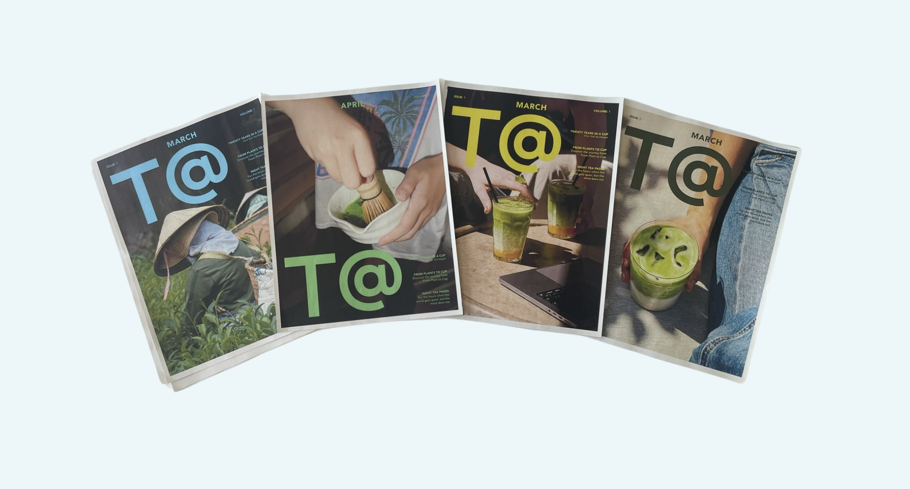
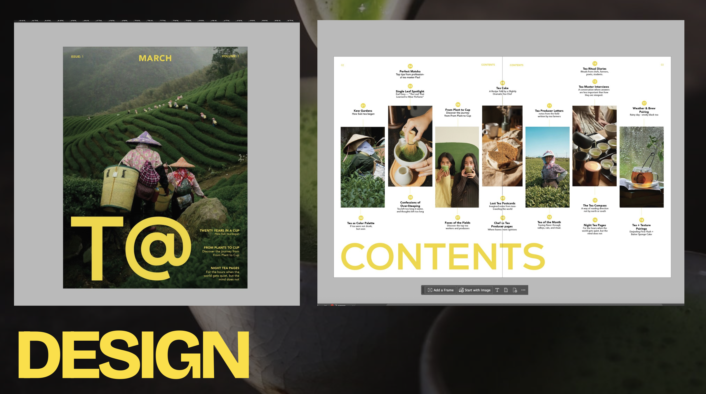
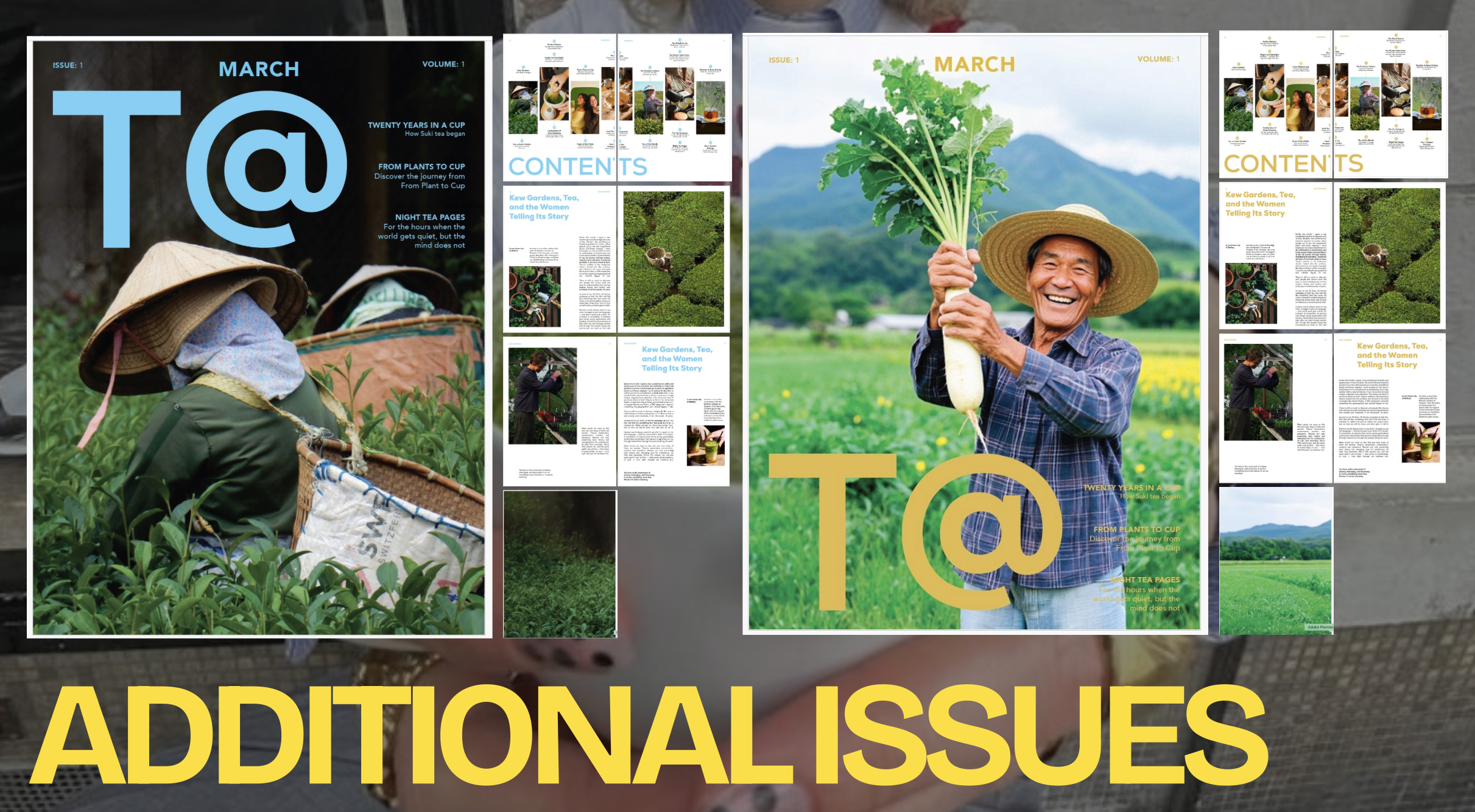
Creating T@ Newspaper, the cover for this project began with an exploratory mock up in Illustrator, where I shaped the foundation of the visual identity (T@). This early stage gave me the freedom to experiment with layout, composition and colour before committing to a full editorial structure. I focused on establishing a clear visual hierarchy, deciding how the masthead, imagery and cover lines would work together.
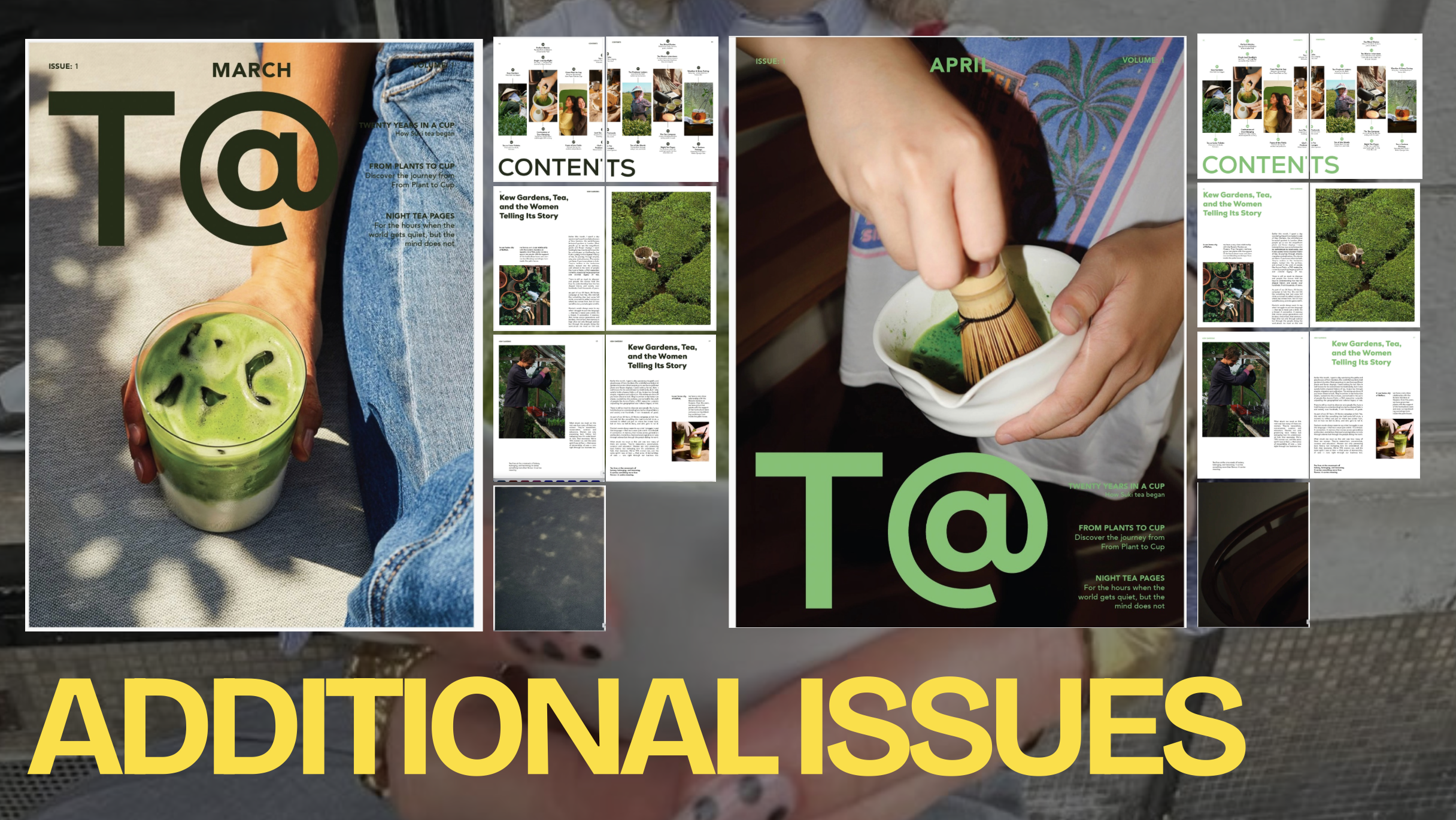
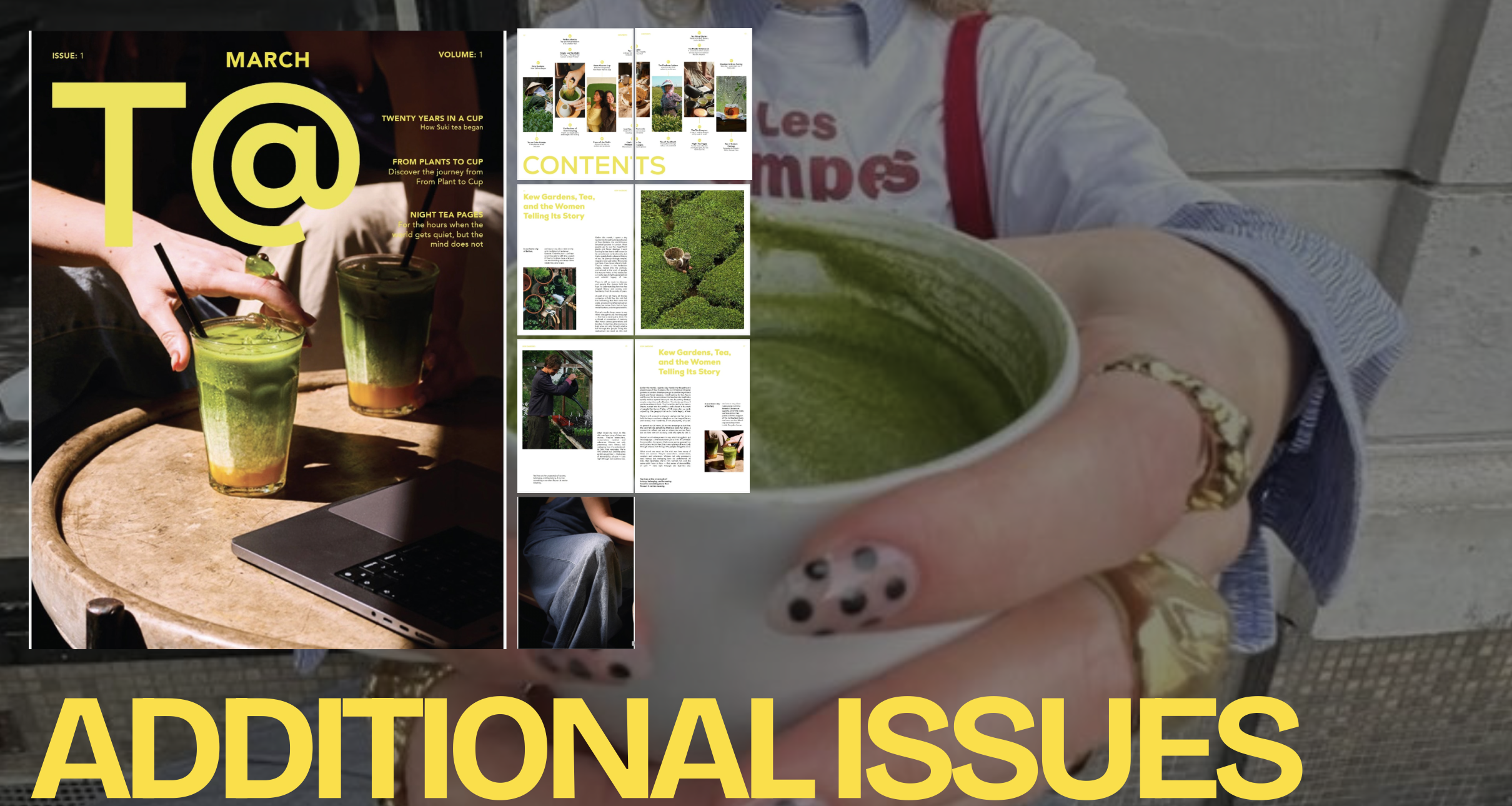
A key part of the identity is the custom t@ logo, designed to represent tea by merging the letters e and an into a single symbol. This small detail became an anchor for the entire brand, giving the magazine a distinctive and memorable mark. The project developed into a series of four covers, each designed to feel part of the same family. They share the same layout, typography and overall aesthetic, but each issue features its own colour scheme to create variety while maintaining consistency.
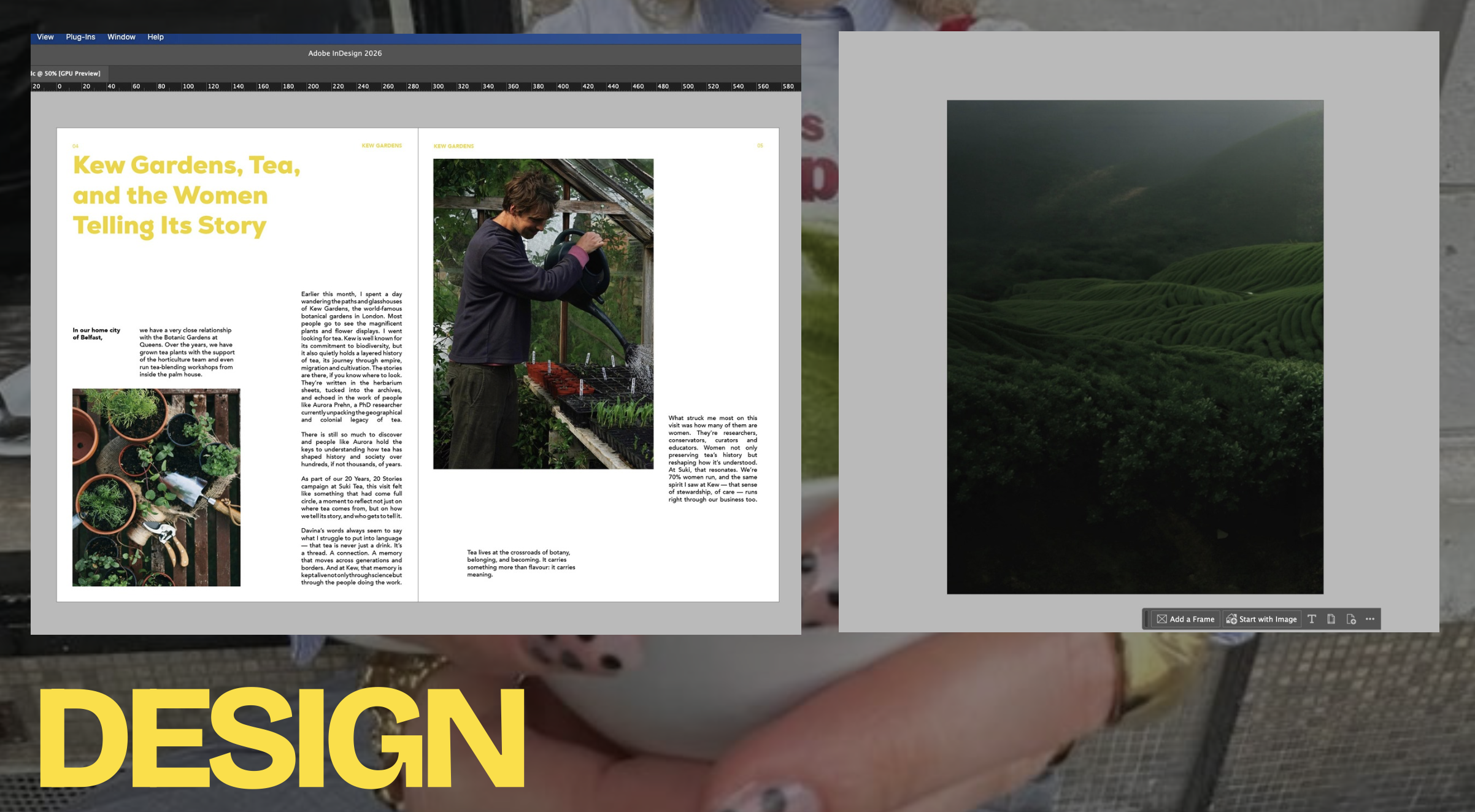
Once the direction felt right, I moved the designs into InDesign to refine them within a structured grid system. Adjusting spacing, alignment and colour balance helped ensure each cover looked polished and professional. The final series reflects a cohesive identity that captures the calm and diversity world of tea.