Toward>
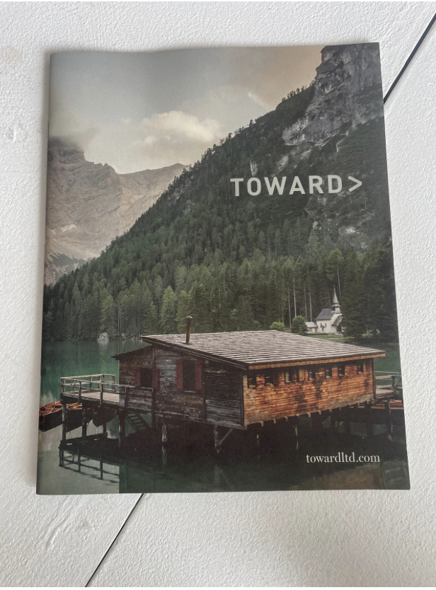
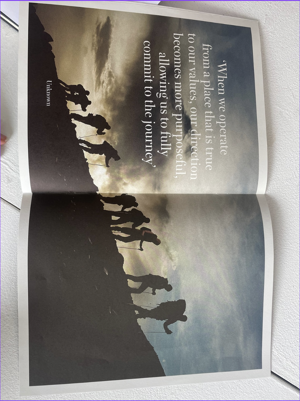
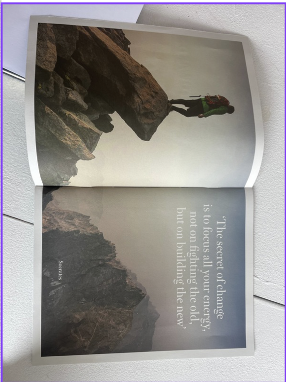
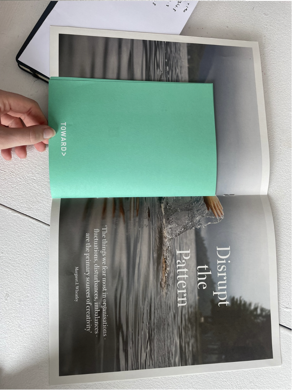
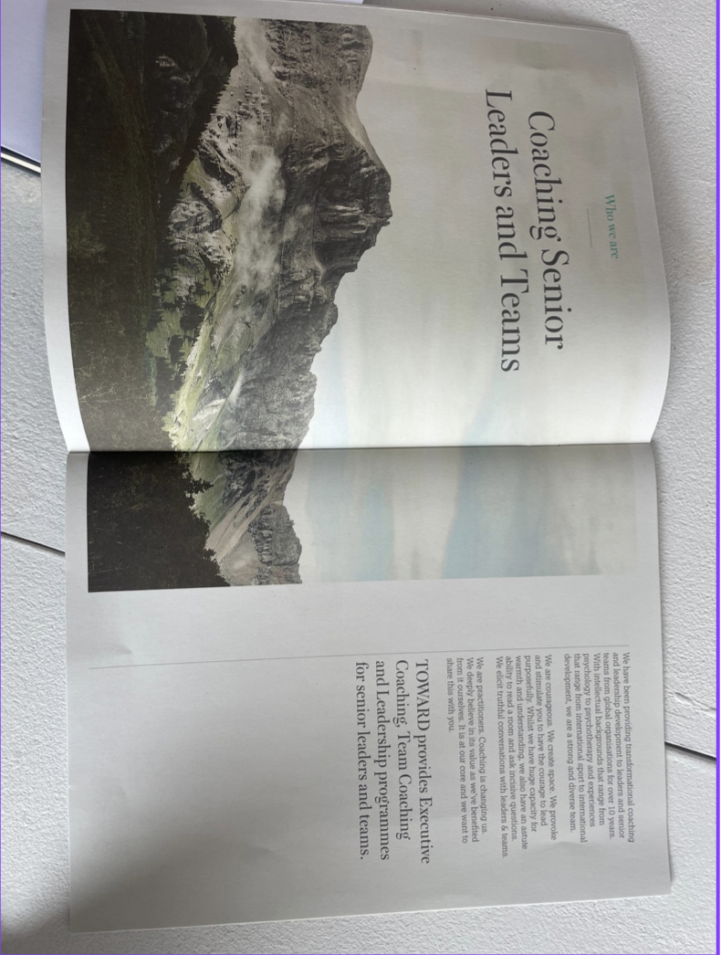
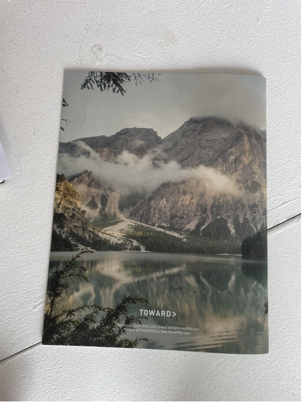
This brochure design presents a refined and contemporary approach to editorial layout, combining strong typography with calm, atmospheric imagery. The use of full-bleed landscape photography immediately establishes a sense of space and reflection, reinforcing themes of growth, disruption, and transformation. These visuals are paired with a muted colour palette, allowing the content to feel sophisticated and considered rather than overwhelming.
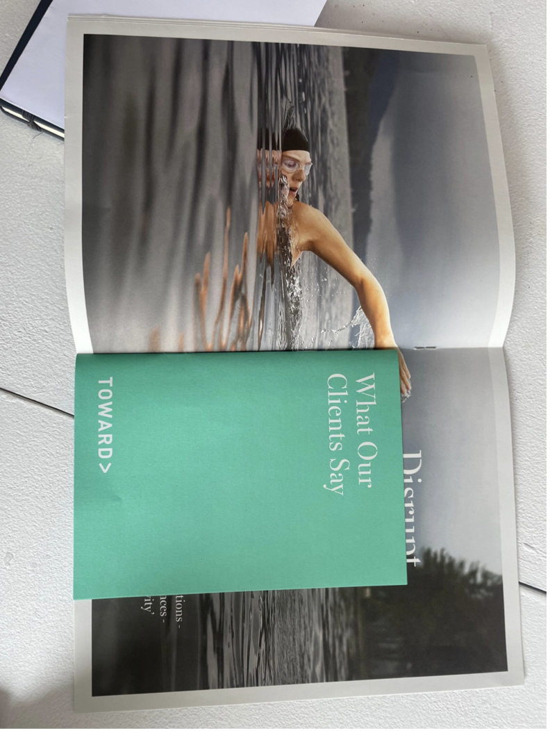
Typography plays a central role throughout the design. A clean serif typeface is used for headings, giving the publication a professional and editorial tone, while the body text remains highly legible and structured. The hierarchy is clear, with large titles such as “Disrupt the Pattern” and “Coaching Senior Leaders and Teams” guiding the reader through the narrative. The use of green as an accent colour subtly highlights key words and sections, creating consistency across spreads.
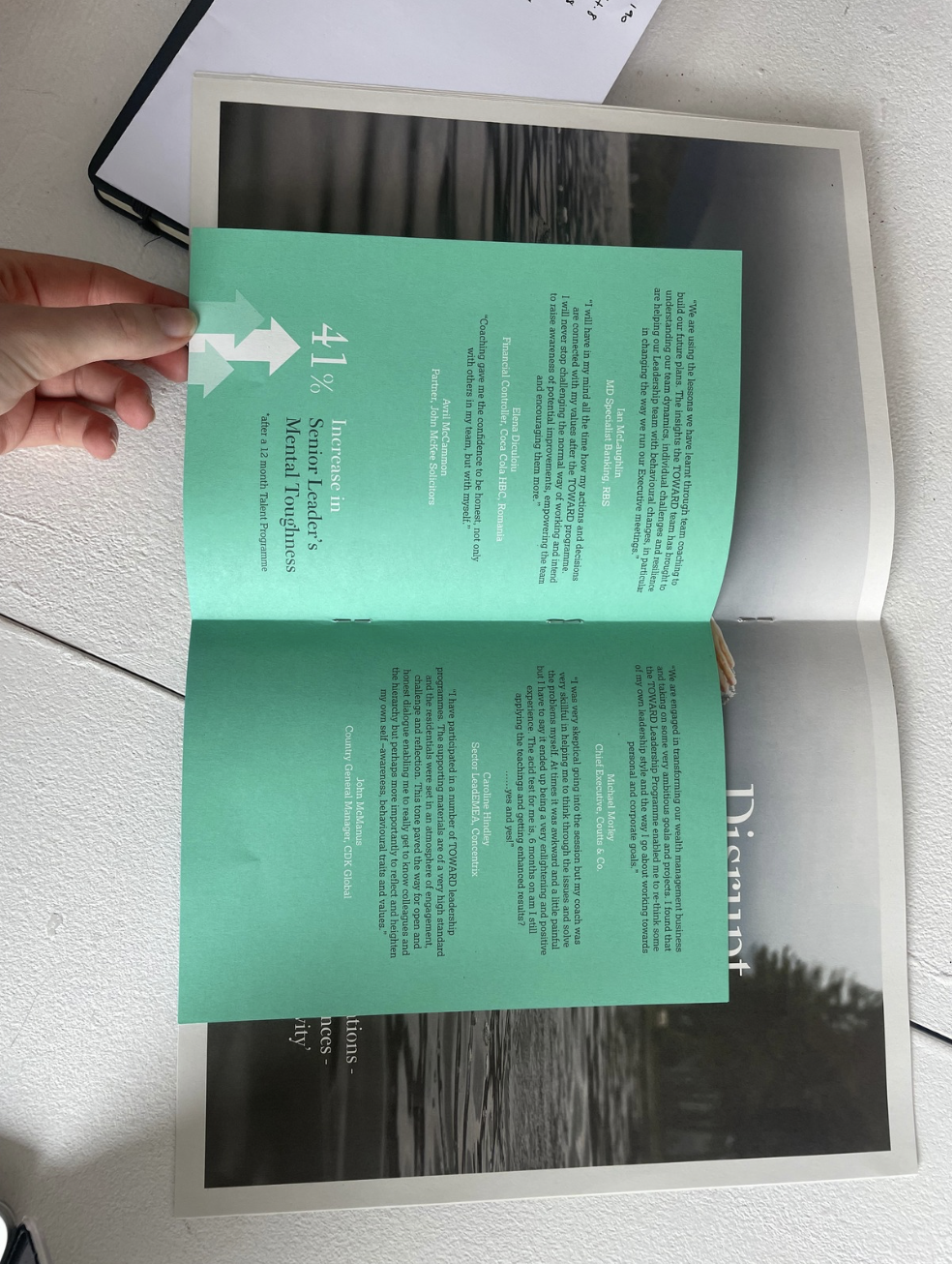
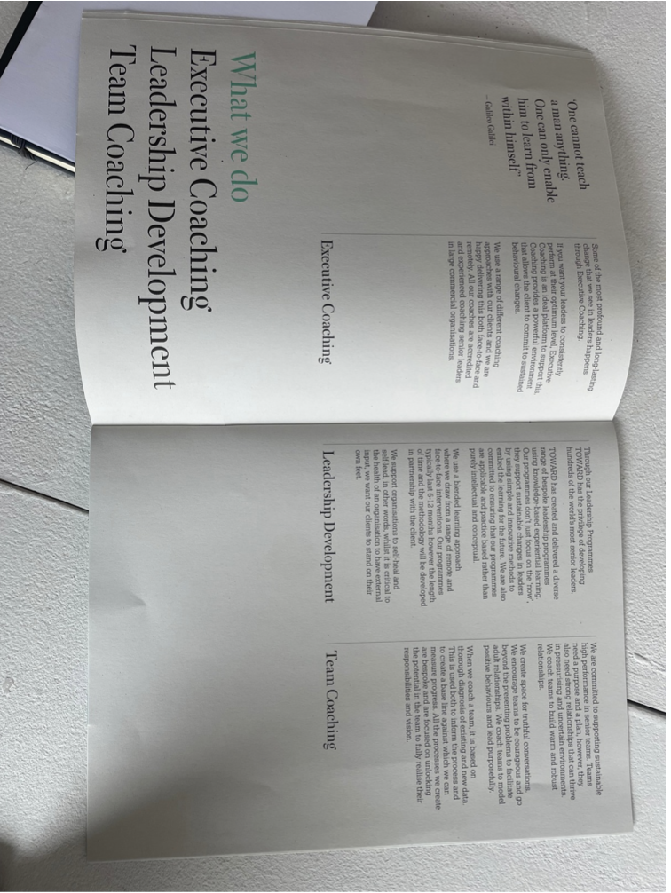
The layout demonstrates a strong understanding of grid systems, with text carefully aligned into columns that create balance and rhythm. There is a clear contrast between dense informational pages and more open, image-led spreads, which prevents visual fatigue. A central tip-in insert adds an interactive and tactile element to the design, breaking the standard page flow and encouraging engagement, while also introducing variation in scale, colour, and material.
Overall, the design successfully balances corporate professionalism with a human, reflective quality, making it both engaging and visually cohesive.